Measurement-Based Care · Client & Provider Portal · 2021–2022

Closing the loop: giving clients visibility into their own progress in therapy

Clients were completing mental health assessments with no feedback. Providers were receiving scores they weren't using. I designed Therapy Journey, SonderMind's first client-facing view of clinical assessment data, and the parallel provider improvements that made measurement-based care work on both sides of the relationship.

↓ Jump to solution

At a glance

↑ 31.6% CQ completion rate peak (from 22.8% at project start)
monthly delivery volume growth, rate held at 27–30% through scale
82,682 assessments completed in a single month by Nov 2022, up from 9,081

My role

Lead Designer

Timeline

Jun 2021–2022

Team

PM · Eng Lead · Clinical Quality Team

Tools

Figma · Playbook UX

Status

Shipped to 100%

The MBC flywheel, and why ours wasn't spinning

Measurement-Based Care (MBC) is the clinical practice of routinely collecting patient-reported data (symptom severity scores, functional assessments) and using that data to adjust treatment. Done right, it creates a self-reinforcing cycle: a client completes an assessment, the provider sees the score, adjusts their approach, the client experiences more responsive care, and is more likely to complete the next assessment.

The clinical evidence is strong. Patients in MBC programs deteriorate less and improve at significantly higher rates compared to routine care. At scale, the data also supports payor negotiations, provider development, and quality improvement. It's one of the few things that's genuinely good for clients, providers, and the business.

The catch: the flywheel only works if the data actually moves. At SonderMind, it wasn't. Clients completed assessments with no feedback. Providers received scores they weren't reviewing. The loop was broken before it could become a loop.

Three different problems, one broken system

Business problem

MBC was a clinical priority, but only 22% of providers were using the data

CQ completion had dropped from ~30% to 12% over 7 months. 78% of providers weren't reviewing PRO data beyond the summary score on their dashboard. If providers weren't using it, clients had no reason to complete it, and the clinical value of the whole system evaporated.

User problem

Clients were completing assessments into a black hole

They had no idea what their scores meant, whether anyone was reading them, or whether they were getting better. The clients who kept completing CQs did it because their therapist told them to, not because the platform gave them any reason to. The ones who stopped had no signal it mattered.

Technical constraint

Scores weren't reliably stored, and the backend was being rebuilt in parallel

The CQ infrastructure was a patchwork of joined tables. Scores weren't reliably stored. The rewrite had to happen alongside the design work, which meant building a display experience for a data model that was shifting under us. We also had a clinical constraint: showing clients PHQ-9 scores that included suicidality questions required careful design from the start.

The research reframe: we went in thinking this was a completion rate problem. It was actually a meaning problem. Clients weren't completing CQs because the act felt disconnected from their care. Making scores visible wasn't just a feature; it was closing a loop that had been open since the beginning.

Three rounds before a single screen was designed

I ran research across three cohorts, starting with high-engagement outliers to understand what completing CQs actually looked like when it worked, then moving to concept testing and usability validation.

Round 0 — Behavioral outlier interviews

I started with the clients who were completing 50+ assessments — far above average

I wanted to understand what made them different, because their behavior was what we were trying to cultivate. Three things consistently came up: their therapist had set the expectation that CQs were part of therapy; they used them for self-reflection between sessions; and therapist follow-up mattered to them. CQ completion wasn't a platform habit. It was a relational one.

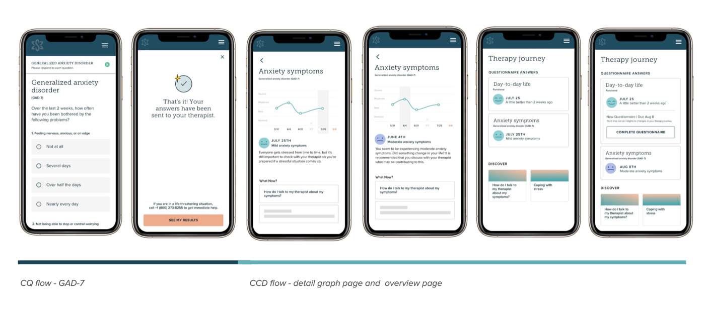
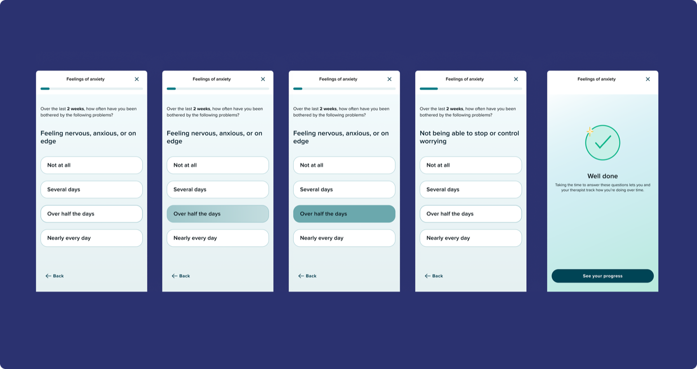
Round 1 — Unmoderated concept testing · 6 participants

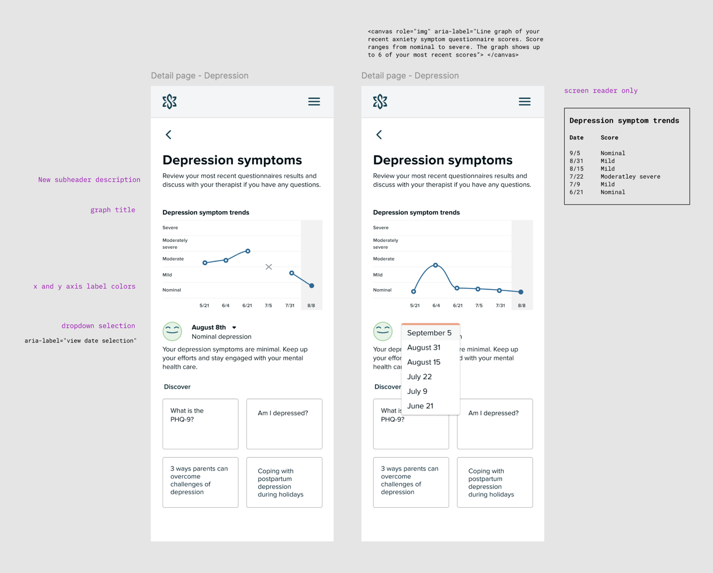
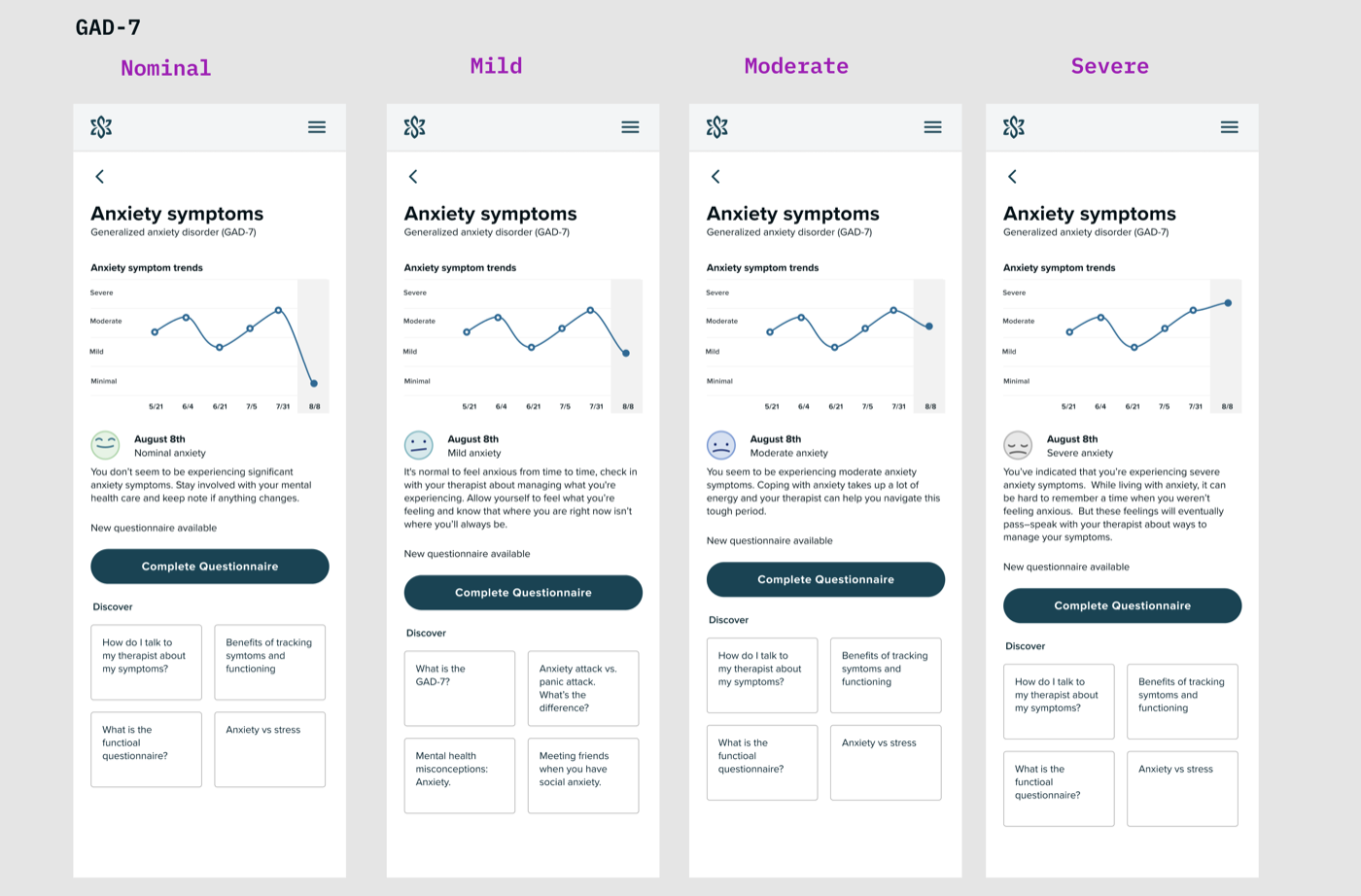
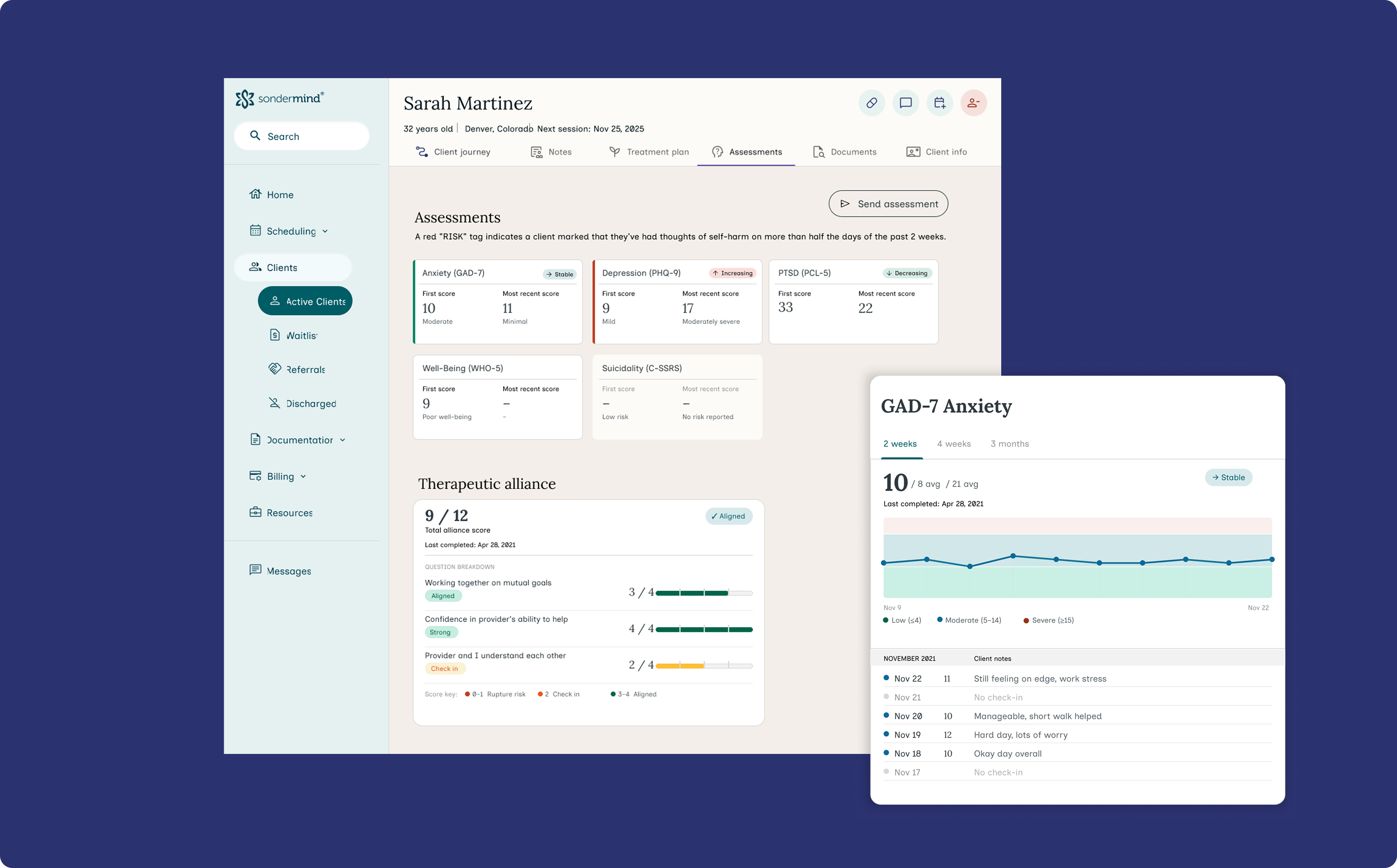
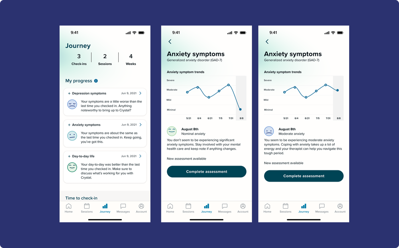
100% expected a graph. None of them wanted to feel judged by an app.

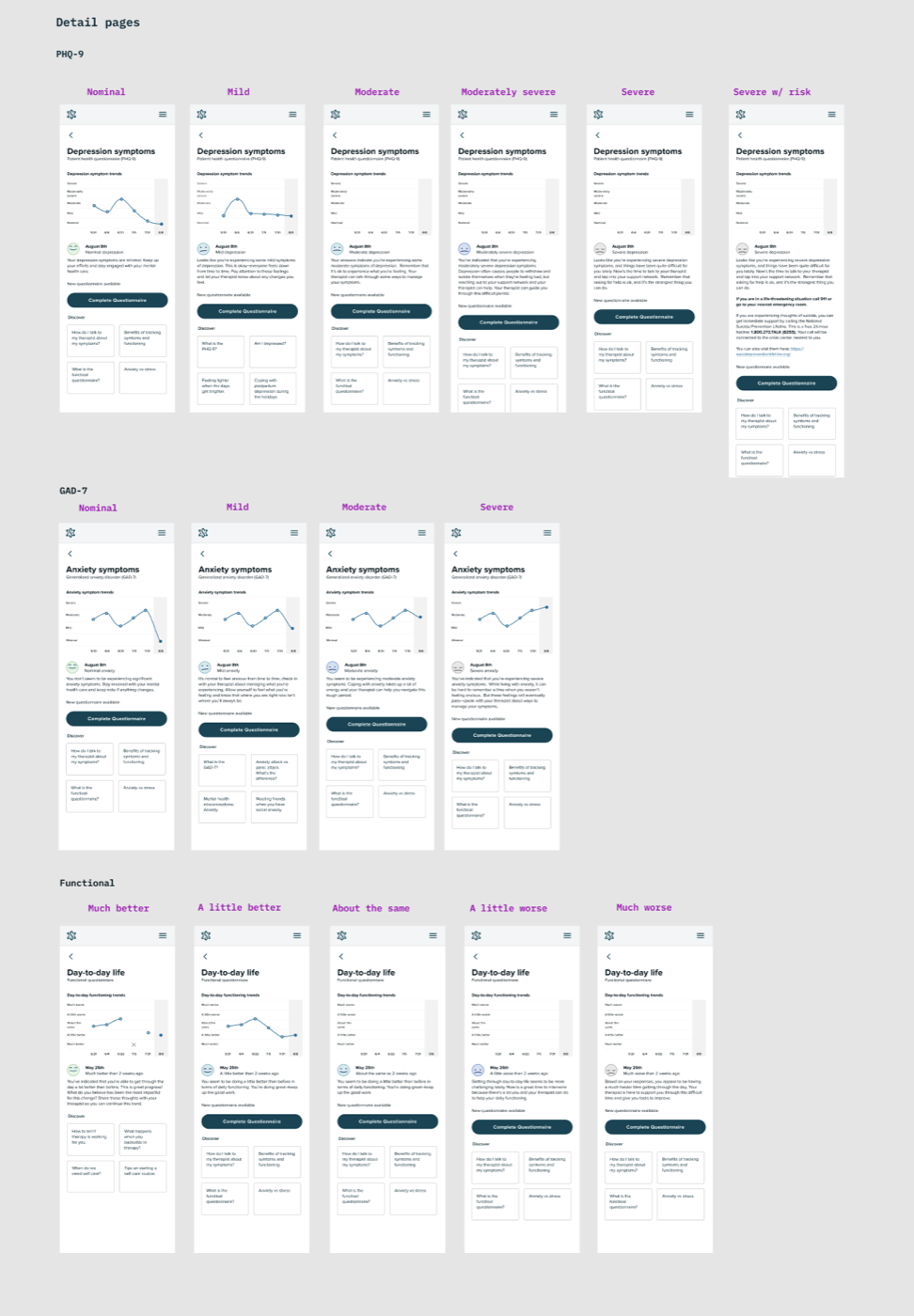
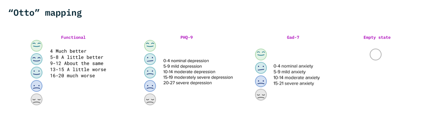
  • Every participant expected some kind of visual showing progress over time — most wanted individual questions broken out, not just a single aggregate score
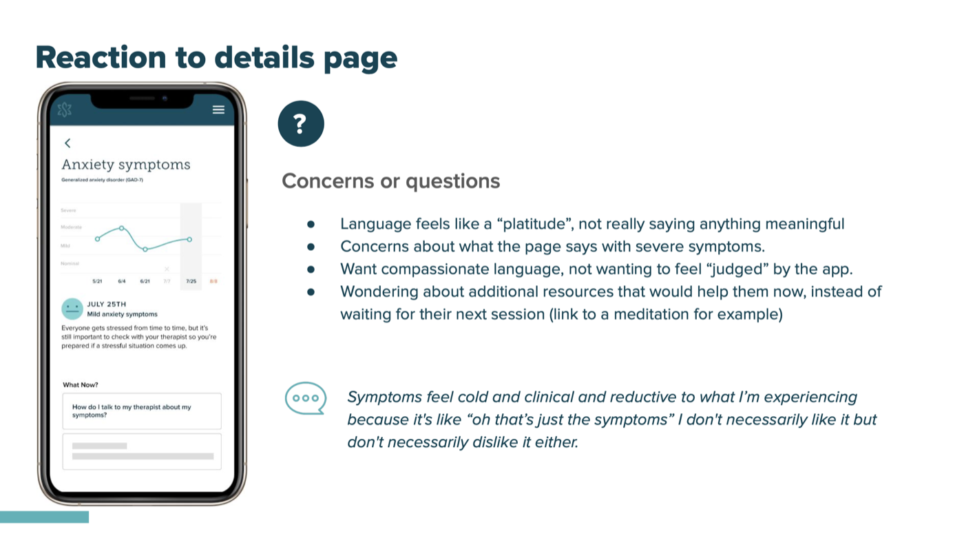
  • When symptoms were worsening, participants wanted gentleness and reassurance, not clinical neutrality
  • Strong expectation that their therapist was reviewing the data and would bring it up in session
"I would want to see graphs so I could see how the questions have been answered over time. I think it would be nice to have a visual where I could quickly be like, 'oh wow, there's a spike in how bad I've been feeling.'"
"Maybe some sort of feedback from my therapist, like 'Oh, I see progress here.' Some sort of statement from the professional, because sometimes I see a graph and I don't know what to make of it."

Round 2 — Moderated usability testing with SonderMind clients · 5 participants

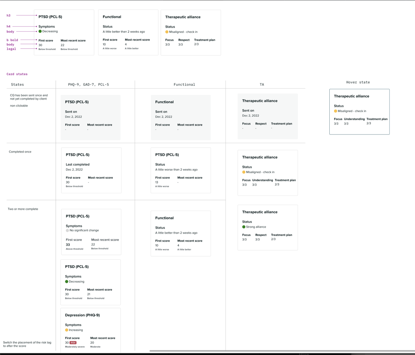
The design landed. The language still needed work.

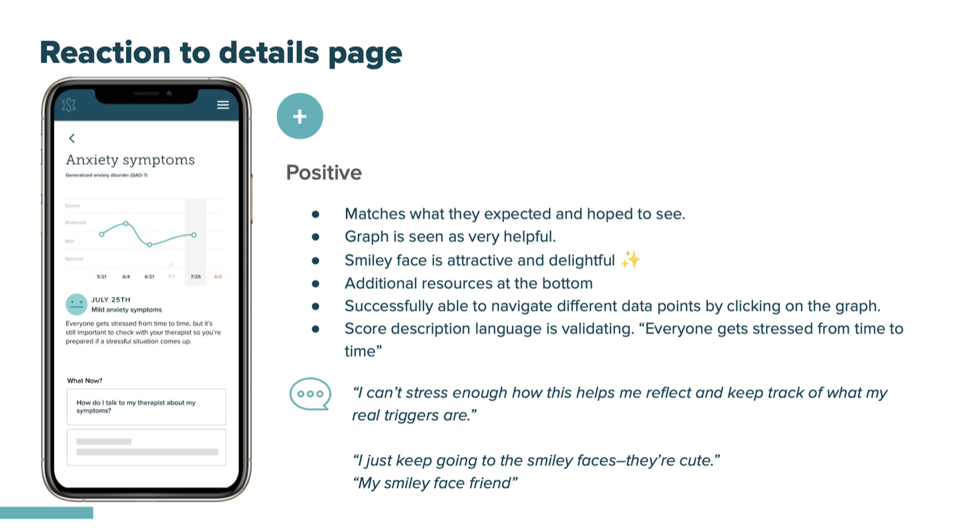
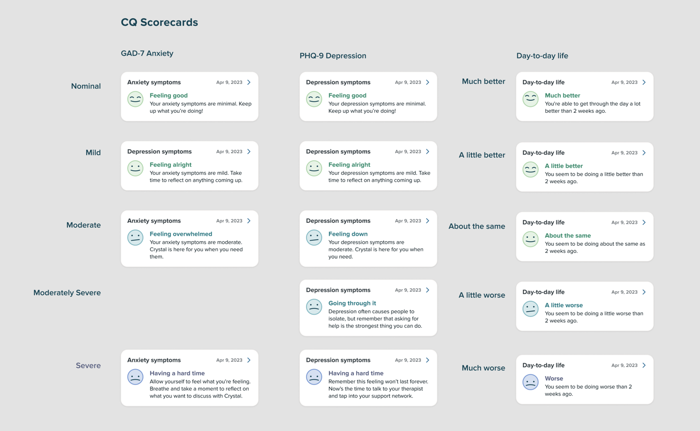
  • "Therapy journey" as a name resonated immediately — "Therapy is a journey right? It's about getting better, even if the numbers get worse."
  • The graph was well-received. The smiley face was described as "delightful" and "my smiley face friend"
  • Language around severe symptoms still felt too clinical — validating but not meaningful. "Symptoms feel cold and clinical and reductive to what I'm experiencing."
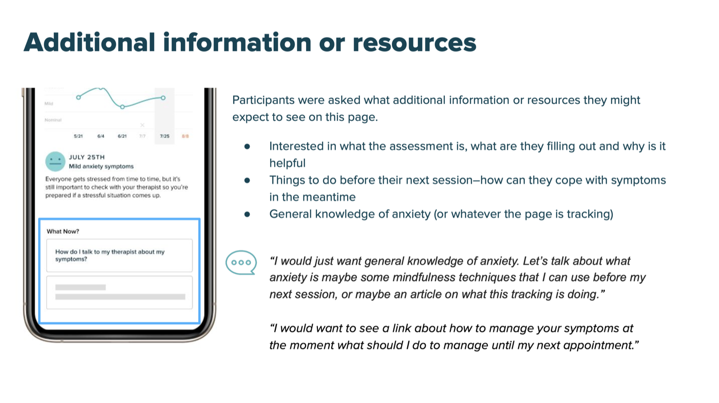
  • Participants wanted resources for right now, not just at their next session
What the research didn't answer: Round 1 used participants who weren't active SonderMind clients, so we couldn't confirm those expectations held for our actual users until Round 2. The therapist-comment feature that multiple participants asked for didn't make V1 scope. We shipped knowing clients wanted therapist context alongside their data, and we shipped without it.
Research overview
Research finding 1
Research finding 2
Research finding 3

Early design directions

Solution exploration 1
Solution exploration 2
Solution exploration 3
Solution exploration 4
Otto mapping — smiley face expressions tied to score ranges for Functional, PHQ-9, and GAD-7 assessments

"Otto" mapping — smiley face expressions tied to score ranges across all three assessment types

Provider portal solution exploration 1

What we cut — and why each cut was a real decision

Every item below was seriously considered. The kills weren't obvious; they were argued for.

Killed

Provider-mediated viewing only

The existing model: providers shared CQ data verbally during sessions. Clinical literature supported this. We chose not to rely on it because providers weren't doing it at scale, and we couldn't gate client access on a behavior we couldn't control.

Killed

Graph visualization on the provider side

We built trend lines for the client-facing Therapy Journey but left them off the provider side. Two reasons: providers were already getting several new CQ types in the same release, and adding a graph on top of that was too heavy a dev lift for the MVP. The rationale that made the tradeoff easier: providers are trained to read scores. A PHQ-9 of 14 means something specific to a clinician without a line going up or down. Clients don't have that training, so the graph was doing more interpretive work for them. The 2023 CQ Visualization initiative eventually closed the gap on the provider side.

Killed

Question-by-question breakdown in V1

Research strongly surfaced this — clients specifically said they wanted to see individual items, not just aggregate scores. We cut it because the backend scoring model didn't support it yet and the engineering effort would have delayed the whole feature.

Killed

Therapist comment overlay

The most-requested feature in Round 1 research. Killed from V1 because it required provider-side workflow changes that weren't scoped. We shipped knowing this was a gap.

Killed

Dynamic in-line coping resources

Round 2 participants wanted something to do right now between sessions. We addressed this partially with a static Discover section. Dynamic resource matching was V2+ scope.

Shipped

Trend graph + plain-language severity + Discover section

Line graph of last 6 submissions per assessment type; severity descriptions in plain, compassionate language ("anxiety" not "GAD-7"); smiley face visual tied to score range; Discover section with static wellness content; separate detail views per assessment type.

Two portals, one flywheel

The design addressed both sides of the broken loop: giving clients visibility into their own progress, and giving providers a more actionable view of the data they were responsible for using.

Provider portal showing the Assessments tab with a GAD-7 Anxiety detail panel — score history, individual question responses, and trend line

Provider portal — Assessments overview with GAD-7 detail

Therapy Journey — GAD-7 anxiety assessment detail page showing trend graph, smiley face, and severity description

Client portal — Therapy Journey GAD-7 detail

GAD-7 assessment flow — five screens showing the full questionnaire from first question through to the Well done completion screen

What taking an assessment looks like — the GAD-7 flow from first question to completion

01

Plain language over clinical labels

Research consistently told us clients found "PHQ-9" and "GAD-7" alienating. Every label was rewritten in plain language: "Anxiety" not "GAD-7," "Depression" not "PHQ-9." Score descriptions were framed around the client's experience, not a diagnosis. "Everyone experiences anxiety from time to time" instead of "Minimal severity."

Cost: required clinical sign-off on every phrase. Slower to ship, right to do.

02

Six-point trend graph with interactive data points

The graph showed the last 6 completed assessments per type. Each point was interactive — clicking surfaced the score, date, and a written description of what that score range typically means. 100% of Round 1 participants had asked for this. Round 2 confirmed it landed.

Cost: only available for clients. The same graph on the provider side was cut from this release — see funnel above.

03

Naming it "Therapy Journey" — not "Assessments"

The name wasn't cosmetic. "Therapy journey" placed the experience inside the client's ongoing care story, not inside a clinical data system. In Round 2 testing, it resonated on first exposure: "Therapy is a journey right? It's about getting better and improving yourself even if the numbers get worse."

This one I'd fight to keep in any future redesign. Naming is philosophy made visible.

Provider portal: a leaner MVP, by design

The provider side shipped without the trend graph. Providers are trained to read assessment scores directly, and adding a visualization on top of several new CQ types in the same release was too heavy a dev lift. What shipped: score summaries per assessment, differentiation between scheduled and manual sends, and a scoring/interpretation section with clinical context alongside raw scores.

What actually happened

Infrastructure problem

We were designing a display layer for data that wasn't reliably stored yet

The CQ backend rewrite happened in parallel with the design work. Some assumptions about what scores would be available, in what format, and with what latency had to stay flexible throughout. At one point a scoring bug meant completed CQs weren't showing up on the client side at all after submission.

MVP debate

The biggest tension wasn't a single feature — it was the right level of data to ship at all

Scoping conversations with my PM and eng lead kept circling the same question: are we shipping enough to be useful, or so much that we're shipping late and fragile? The graph-vs-no-graph call on the provider side came up multiple times. It took a principled argument, not just a scope call, to close it.

Language problem

The line between "compassionate" and "empty" is hard to find in a fixed text string

Round 2 research flagged that our severity language still felt "platitude-y" even after we'd improved it. Participants said it was validating but not meaningful. We knew we hadn't fully solved it and treated it as a known gap going into launch. It's still unresolved.

The gap we shipped with

Clients wanted their therapist's voice in the data. We shipped without it.

The most-requested feature in Round 1 was therapist comments alongside scores. We knew this going in and scoped it out anyway. The research was set up to validate the display approach, not to challenge whether the whole interaction model (client sees data, interprets alone) was right. That's worth owning.

Completion rate up, and it held as volume grew nearly 7×.

22.8% → 31.6%

CQ completion rate

Jan 2021 → Nov 2021 peak

27–30%

Sustained completion rate through 2022

Despite ~7× volume growth

~40K → 275K+

Monthly CQs delivered

Jan 2021 → Dec 2022

82,682

Completions in a single month

Nov 2022, up from 9,081 in Jan 2021

"I can't stress enough how this helps me reflect and keep track of what my real triggers are."

SonderMind client · Round 2 usability study

"Therapy is a journey right? It's about getting better and improving yourself even if the numbers get worse, you know, you keep trying."

SonderMind client · Round 2 usability study

Platform-wide data, not a controlled study. Network growth and other improvements were in play during this period. The trend inflection in late 2021 aligns with the Therapy Journey release, and the stabilization through 2022 suggests the experience change held at scale. Whether higher completion rates actually improved clinical outcomes is a longer measurement horizon we didn't have instrumentation for at the time.

What I'd do differently, and what I'd fight to keep

01

The infrastructure dependency was underestimated

Designing the display layer while the scoring backend was being rebuilt meant we hit walls mid-build that wouldn't have come up in a normal discovery process. Next time I'd push for explicit alignment on data model readiness before committing to visual scope.

02

Research found what we designed for — but not what we didn't design

Both rounds surfaced things we could act on. But the research was set up to validate the display approach, not to challenge whether the interaction model itself was right. We knew clients wanted therapist context alongside their data and shipped without it. Worth naming.

03

The naming was the thing I'd fight to keep

"Therapy journey" over "assessments" or "clinical data." "Anxiety" over "GAD-7." These weren't polish. They were a position about who this tool was for and how it should make people feel. In a product full of clinician-facing language that leaked into client surfaces, getting this right mattered. Future iterations that revert to clinical labels will lose something real.

Next case study

The billing page that was blocking clients from continuing therapy

Read it →