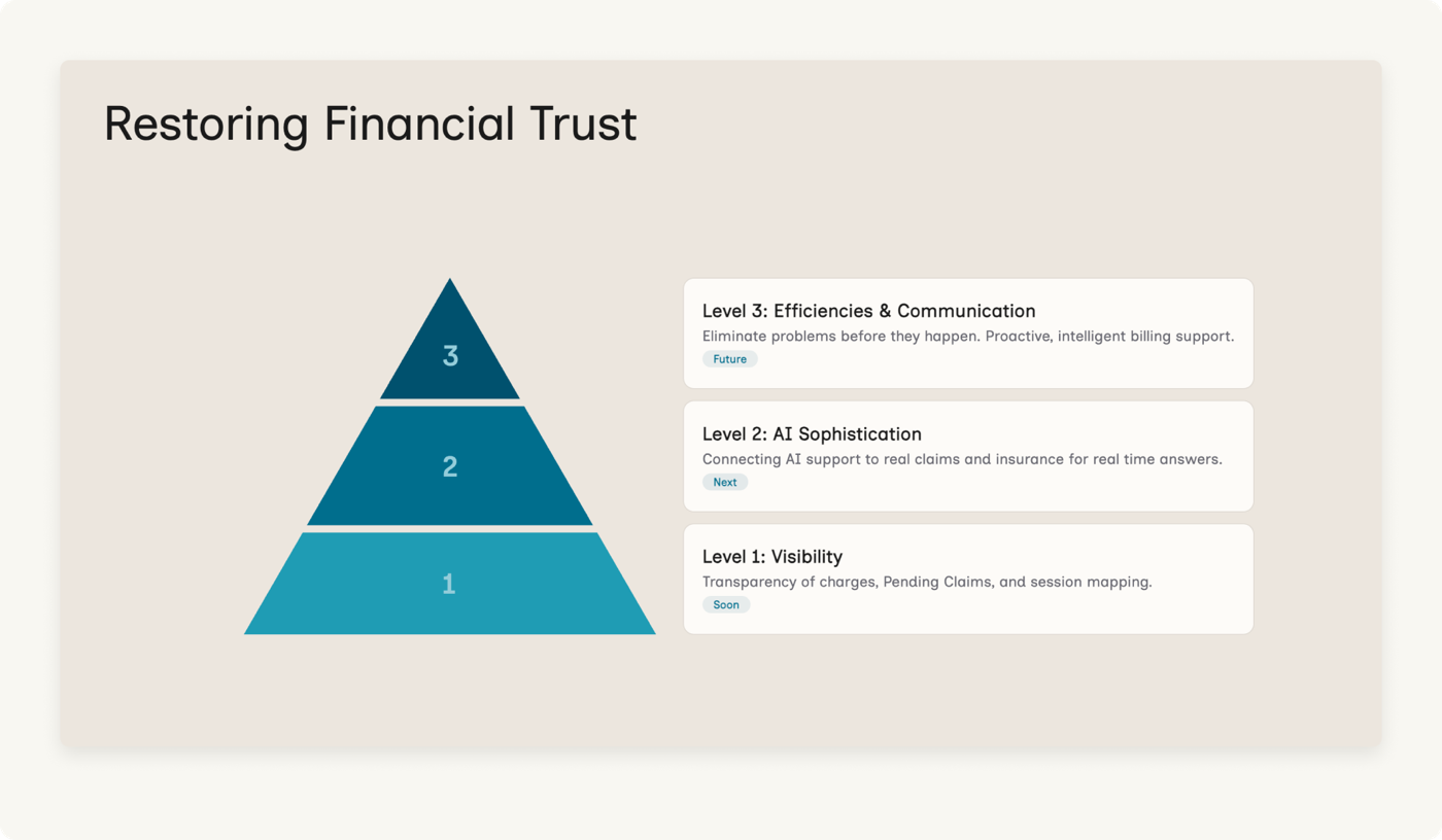
Discovery
Learning from SMEs, mapping the client experience, and churning the support data with AI.
Before designing anything, I needed to understand what "confused" actually meant, and whether a better page would even solve it. Several other people had already proposed solutions: better copy, or explaining what a deductible is, or fixing payment processing issues. Those ideas are fine. But they didn't address the source of the problem. They were band-aid fixes.
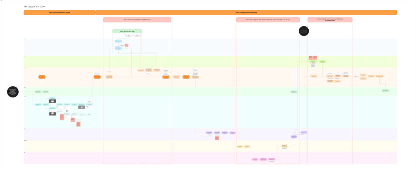
The lifecycle of a client: mapping the full claim journey across client, provider, and system layers to identify where things broke down
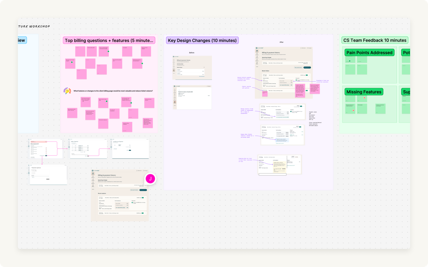
Cross-functional workshop: surfacing top billing questions, CS team feedback, and key design questions before scope was locked
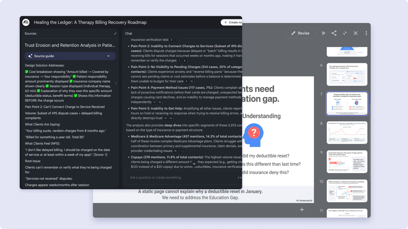
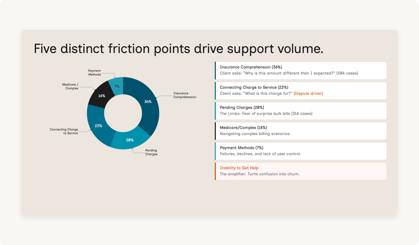
AI-assisted data analysis: Claude clustering 3,203 support tickets alongside the research framing. The AI surfaced categories. The root causes required human interrogation on top.
Quantitative analysis · 3,203 support tickets + 55 NPS verbatims
AI clustered the data. I interrogated the clusters.
Why this method
3,203 contacts is too large to read manually. AI-assisted clustering was the only way to get full coverage in the time available. I gathered support call transcripts, emails, NPS data, interview notes from support reps, and my own client survey data into NotebookLM, then used Claude to cluster it into themes. But AI surfaces what clients say, not why. That required a second pass before the output was usable.
What was found
Two dominant clusters: "Copay & Payment Confusion" (1,629) and "Card on file errors" (1,442). At surface level, two distinct problems. At root, the same cause: a 45-day information blackout between session and charge.
What it didn't answer
Volume tells you what people call about, not how frustrated they are. And not every frustrated client bothers submitting a support ticket. Some just stop rebooking.
Billing comprehension survey
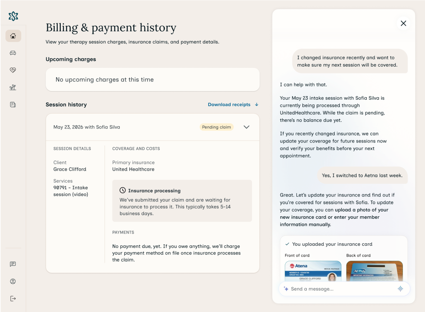
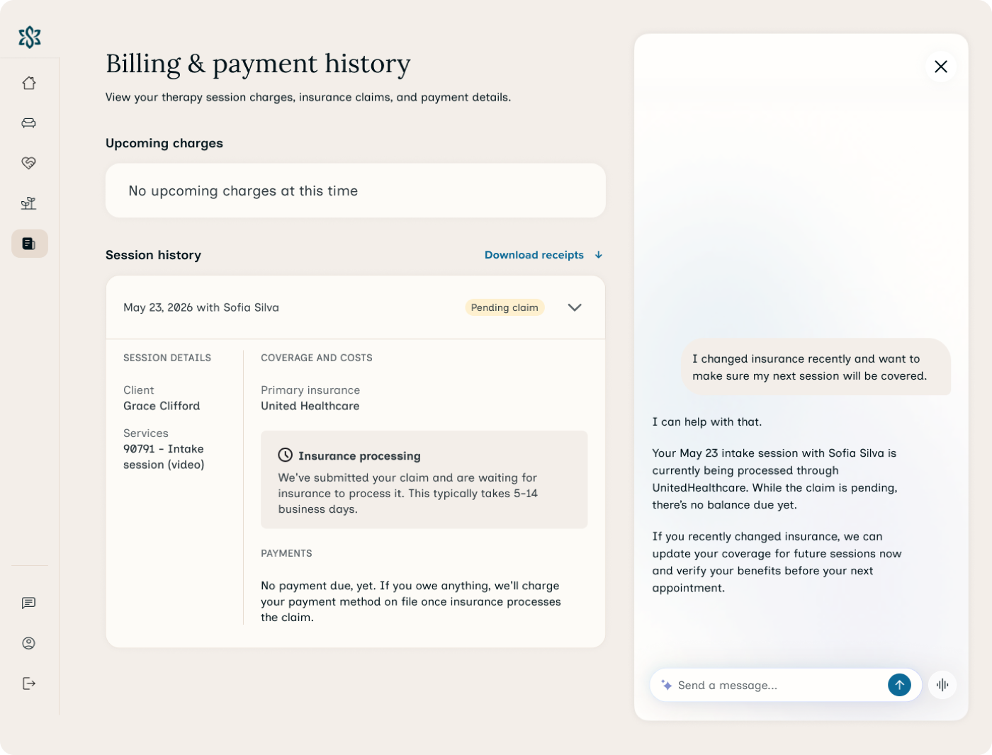
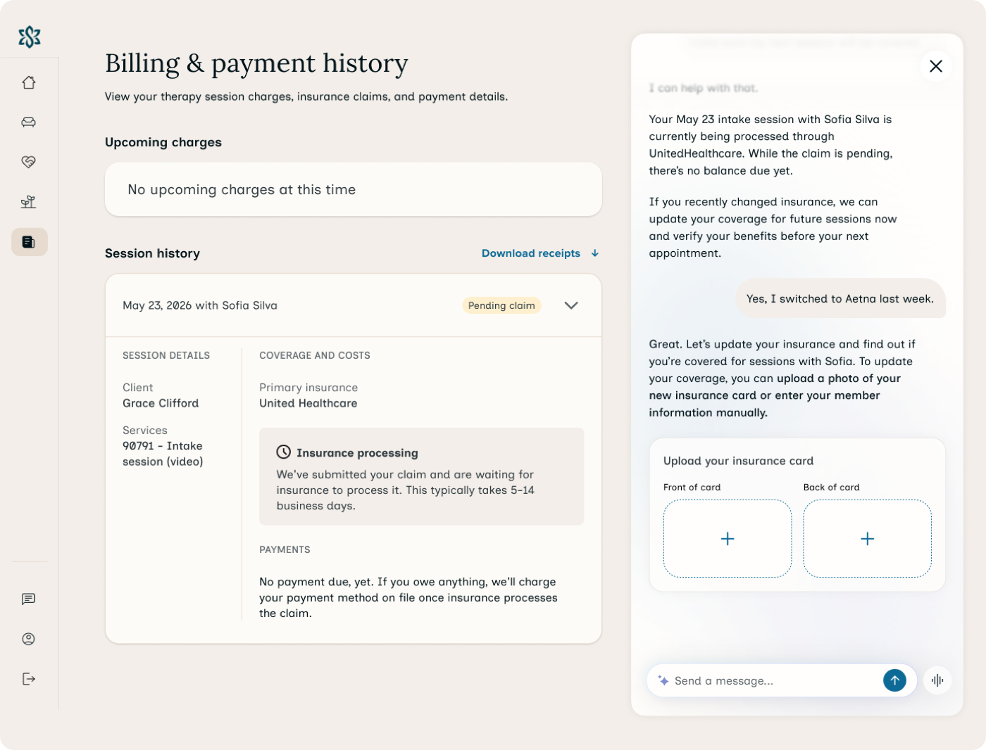
"Covered by insurance" is a phrase that actively misleads clients.
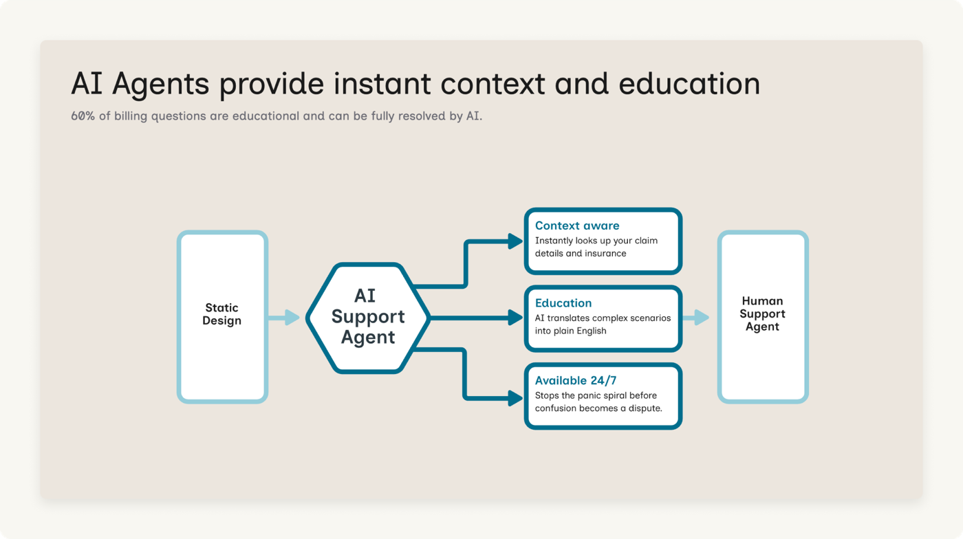
When providers say they "accept insurance" or are "in-network," clients interpret that as "I won't be charged." They don't have a working model of copays vs. deductibles vs. coinsurance. The #1 ask: be able to contact someone immediately when something is confusing. That directly justified the AI support layer.
Competitive analysis · telehealth platforms + insurance portals
Clients already have a mental model for billing. I wanted to meet it, not fight it.
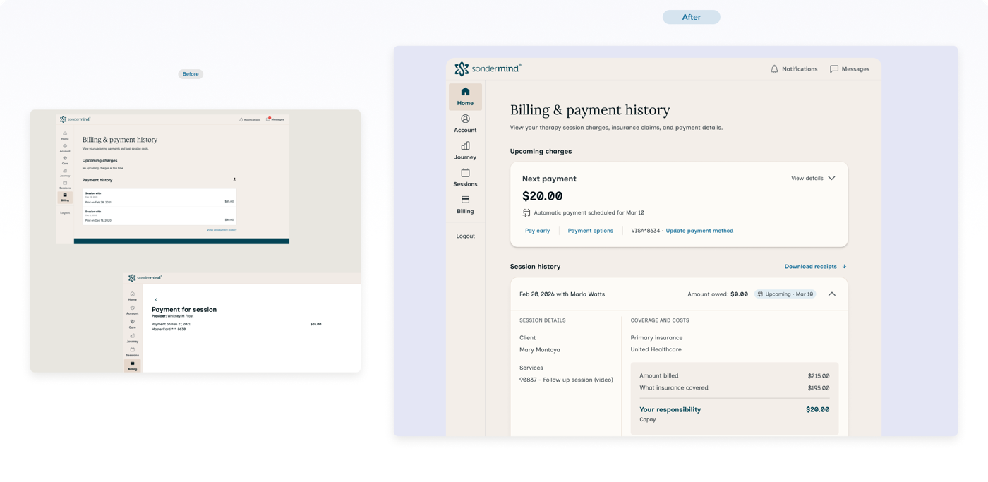
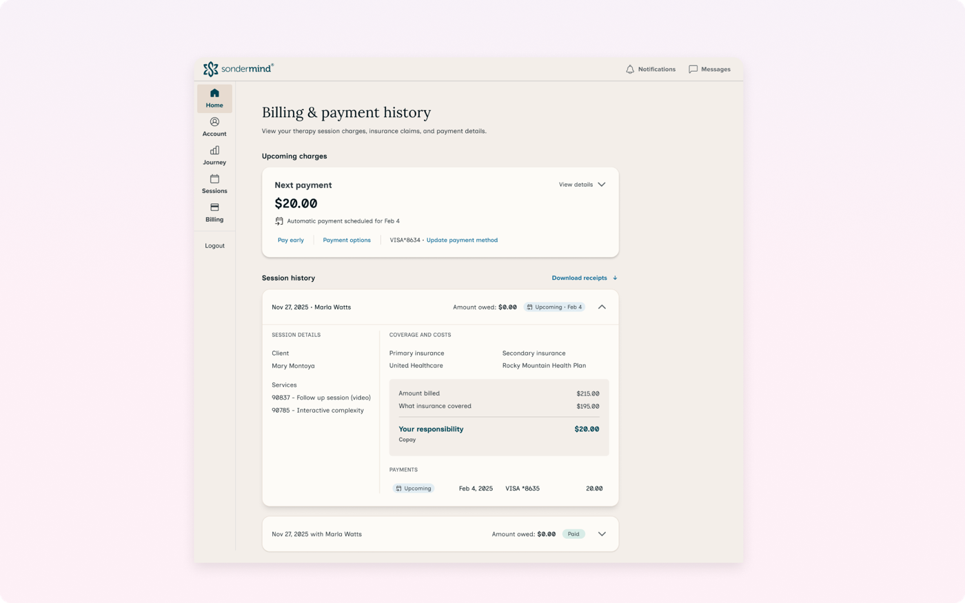
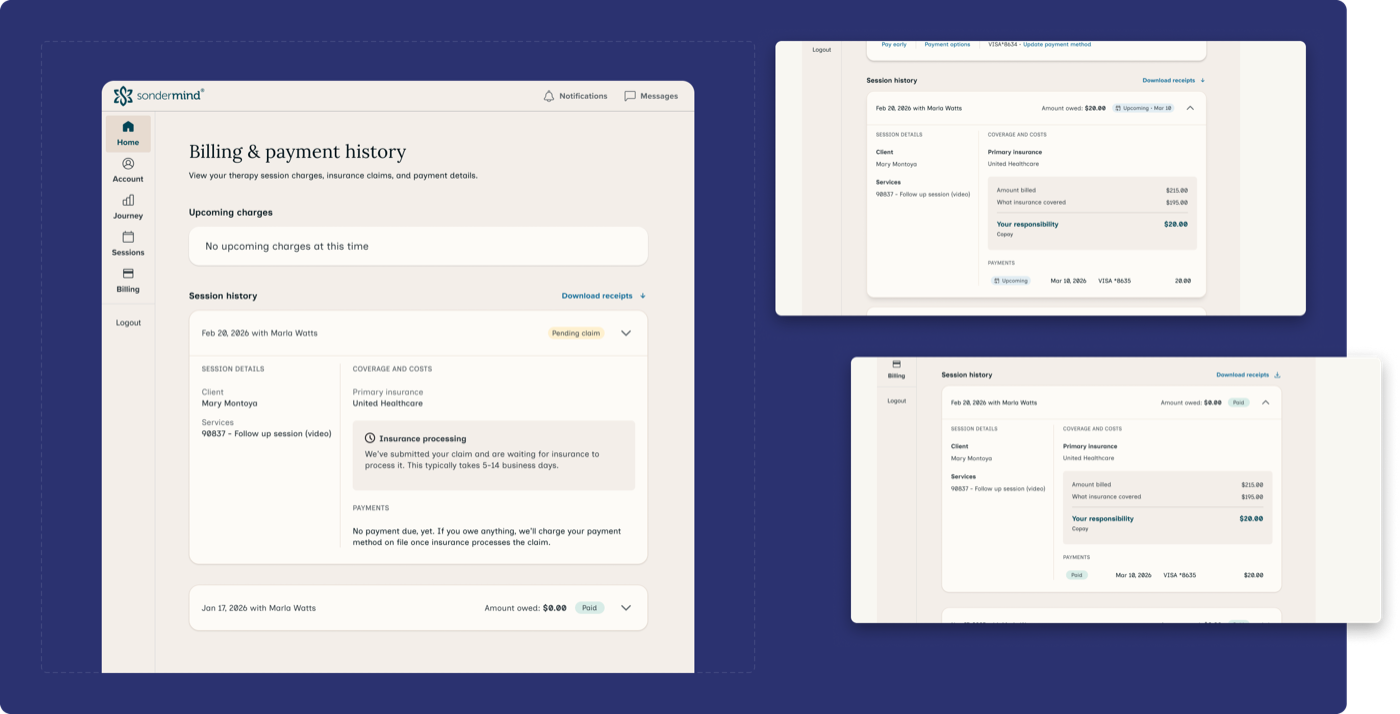
Most telehealth platforms are payment-first. Traditional insurance portals use EOB format: billed vs. allowed vs. patient responsibility. I reviewed my own EOBs and ran a competitive analysis on similar platforms to pressure-test the language. The most useful insight was how to structure the bill info. Clients want to see first and foremost what they owe for their session, if anything. They also want the breakdown: what insurance covered, what their portion was, and why. Seeing what insurance covered confirms their insurance was accepted and used for their therapy session. That became the core of the processed claim card.